Cambridge One
Creating a seamless responsive experience for learners and teachers of english as a second language.
Role
Lead UI/UX designer
Client
Cambridge University Press
Year
2020
-
My role
Product designerSkills required
Remote user testing
Synthesising research data
Heuristic evaluation
User flows & user journeys
Prototyping with Sketch & InVision
Design systems
UI design
Running feedback sessions
Remote & in person collaborationEnd Result
Creating a seamless responsive experience for learners and teachers of english as a second language.
Goals
Optimise and design new learning activities within the limitations of the eLearning software.
Continuous improvement of highly scalable design system and templates. Allowing responsiveness from a mobile screen through to an interactive whiteboard.
The team
The all-in-one eLearning software used to power the learning activities was provided by a third party called Avallain. I was the lead UX/UI designer in the Avallain product team, who I worked with remotely.
I was also part of the Cambridge University Press design team worked closely with the head of design and members of the education product teams.
Who is Cambridge One for?
Cambridge One is a platform for teachers and learners of english as a second language.
It provides easy access to all teaching and learning materials in one place across multiple devices.
It aims to engage children, teenage and adult learners so they are motivated and challenged.
Optimise and design new learning activities
The education product teams provided user feedback which they received through a continuous improvement research programme. In each design sprint I used design thinking to bake in these data-driven findings to ideate, design and validate features before they were developed. Below I have outlined the process and written three case studies to show how the process worked for different features.
-

Empathy
Combine the latest user research and specific learning objectives.
-

Define
Define a specific problem we want to solve.
-

Ideate
Collaborate with the team to come up with solutions.
-

Prototype
Prototype of the new feature or improvement.
-

Test
Remote online user testing using specific questions to ensure a measurable output.
Case study one
Empathise
Hearing and practising the pronunciation of words helps learners to gain confidence speaking a foreign language out loud.
Can we increase the opportunity for learners to hear english being spoken by combining existing activities?
Define
How might we combine audio and drag and drop?
Ideate & Prototype
Using the design system to combine the play, pause buttons with drag and drop tokens. Ensuring there is enough tappable area to select either ‘play’ or pick up the token itself.
I built an InVision prototype that started with all tokens in the token pool at the bottom of the screen. The prototype enabled participants to add some or all the tokens to the category drop zone in the middle of the screen and complete the exercise.
We used a direct question rather than a more realistic one to remove any bias the question could pose.
Validate
📋 Unmoderated, remote user testing.
6 participants complete a simple drag and drop with word and audio
6 participants complete a simple drag and drop with only audio
✅ 11 participants could successfully complete the exercise without mistakenly selecting the token or the play audio button?
📣 Many participants commented that the design would be improved by using a drag and drop interaction. It’s interesting to note that all 12 participants attempted to ‘drag’ the tokens before realising they had to ‘tap and tap’. 1 participant did not understand the tokens were ‘tap to place’ and abandoned the exercise.
Next steps
The findings were shared with the onboarding and product guidance teams to include in their work. To mitigate this risk in the short term it was decided to add the instruction ‘tap to place’ in the question and take this feature into another round of validation in the next sprint.
Case study two
Empathise
Some learning activities require watching and re-watching a video to complete. On larger screens and whiteboards this is an easier task as other tabs and screens can be used. On a mobile device this becomes more tricky.
Define
How might we allow quick access to video content on mobile screens?
Ideate & Prototype
To have a video open in a different tab on a mobile device means several taps between watching the video and interacting with the task. The solution we tested kept a small video which collapsed into a sticky video bar only one tap away next to the task at hand.
I built an InVision prototype that tested this concept using GIFs to mimic a video playing.
We used a direct ‘easy’ question rather than a more realistic one to remove any bias the question could pose.
Validate
📋 Unmoderated, remote user testing.
6 participants answer a multiple choice question about the video - starting enlarged.
6 participants answer a multiple choice question about the video - starting minimised.
❌ No, participants did not find the minimised format useful, even though they could use it.
📣 While all participants were able to use the feature as intended they did not appear to find a minimised video very helpful, and wanted the video to be full screen. Participants tended to treat the video as they normally would - not as a ‘sticky’ feature.
Next steps
Add a continuous video feature into activities but use a standard size video which expands to full screen view. Allow video to scroll up or down with content on small screens rather than create a sticky header component. There is no need for the minimised player.
Case study three
Empathise
Customer feedback and user research shows the drag and drop (or ‘tap and tap to place’) tasks work really well on large whiteboards in classroom environments. On small devices like mobile phones, the tokens stack on top of each other and block the activity area of the screen. Making it impossible to complete a task.
Define
How might we optimise complex drag and drop tasks on small screens?
Ideate & Prototype
To remain responsive the drag and drop task needed to use the same components as the large screens. To comply with the e-learning software the layout had to stay the same too. The token pool at the bottom of the screen and the drop zones in the middles of the screens had to stay in the same place.
After a few designs I decided to go with the simplest solution for mobile screens with horizontal scrolling of one line of answer tokens in the ‘token pool’ at the bottom of the screen. I introduced arrows so users could also tap the left and right arrow buttons to scroll or use a swipe gesture to view all the tokens. In existing learning activities some of the tokens can be very long and complex, we wanted to see how this would translate into real activities.
To validate the interaction on mobile the learning activities were re-built in code rather than InVision, as prototypes were just not realistic enough. We had participants go through six different questions with different lengths of tokens, to ensure we could see interactions with varying types of exercises and content.
Validate
📋 Unmoderated, remote user testing.
6 participants completed 6 different drag and drop questions on mobile.
✅ Participants can use the scrolling token pool. However the usability fails when the tokens are very long EG use full sentences.
📣 Neither overlapping content or very long tokens actually prevented users from completing the drag and drop activities. However, major frustration was caused by using very long tokens in some activities, which this format was not designed for. Participants had to change to landscape view or scroll for a very long time.
Next steps
Adding a horizontal scroll to the token pool on small screens adds value to the user by allowing multiple tokens to be used in each task without the tokens stacking to far over the activity. However, the content of each token makes a big difference to the usability of the task. Single words or short phrases work best. Whole sentences exceed the width of small device screens and become very hard to read in context.
Optimise the tokens for a ‘worst case’ small device, so they can wrap when they touch the edge of a screen. The best course of action is to start to use a different activity type for full sentences.
Responsive design from whiteboard to mobile
One of my other goals while working on Cambridge One was to develop a responsive design system and activity template to consolidate the wide range of learning activities at the different levels of education.
Branding was already in place, but design and UI needed organisation and curation to allow the team to focus on user experiences and future concepts rather than finding the right component.
Consideration was also given to how tasks that worked in classroom environment on a whiteboard would work in person on a mobile device.
Audit, curation and creation
The process began with auditing and curating all existing brand and UI assets. Identifying gaps, creating new assets and documentation. I organised and built a pattern library in Sketch, a style guide and screen templates from mobile up to interactive whiteboards.
The design team could have easy access to the latest design elements to create, modify and build learning activities across different ability levels, age segments and devices.
Overview of design system

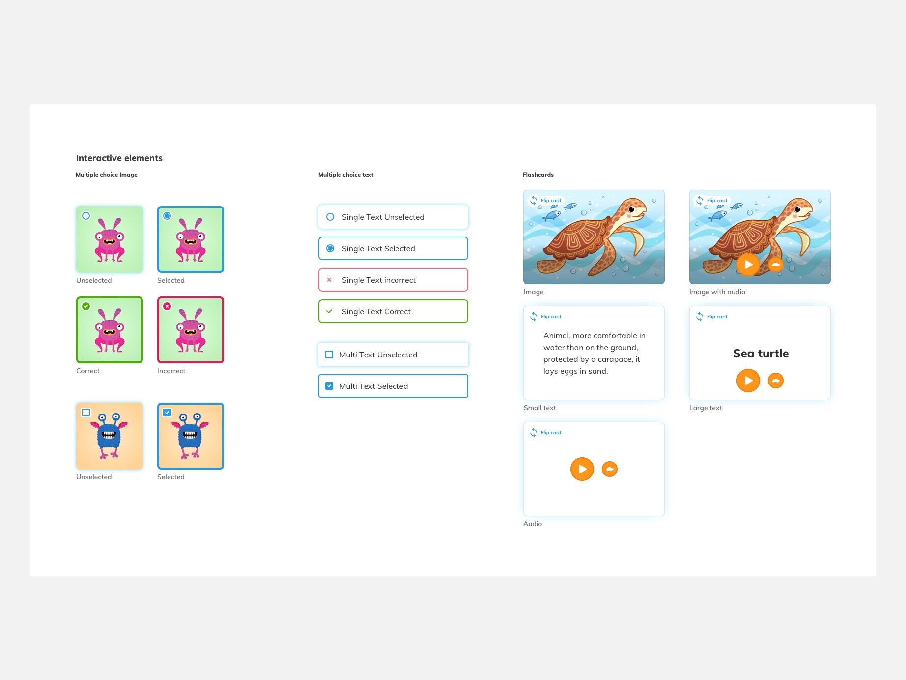
Interactive elements from the Primary pattern library in Sketch

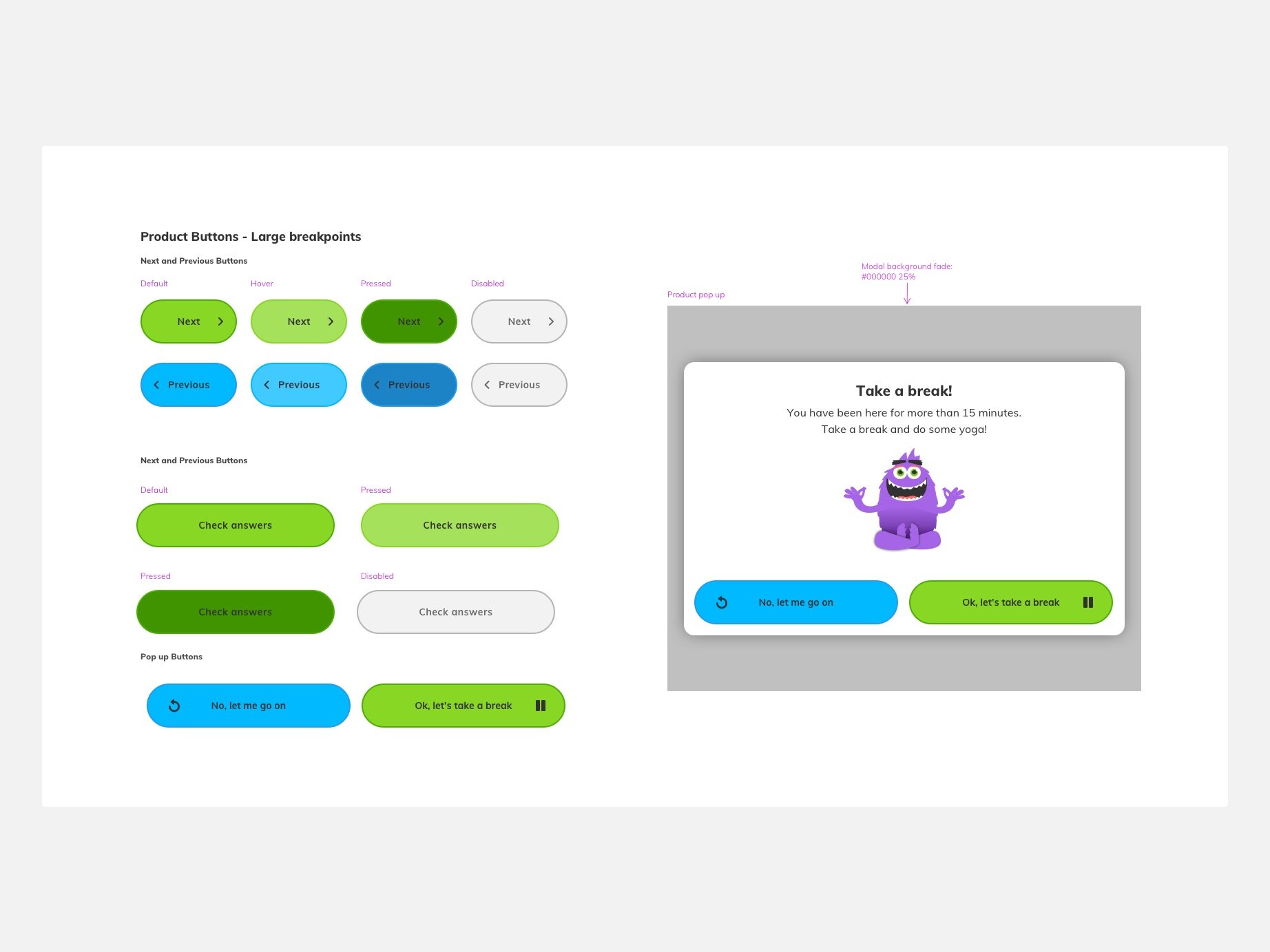
Buttons from the Primary pattern library in Sketch

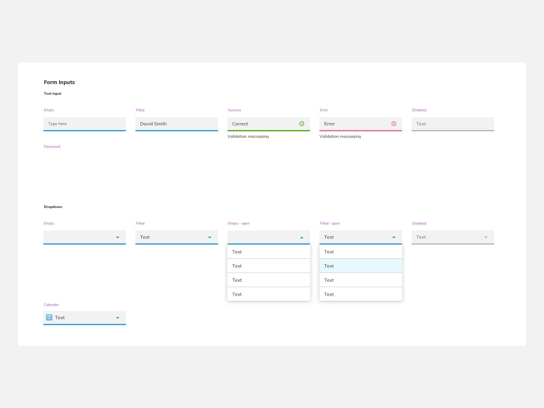
Part of the forms section in the Primary pattern library in Sketch

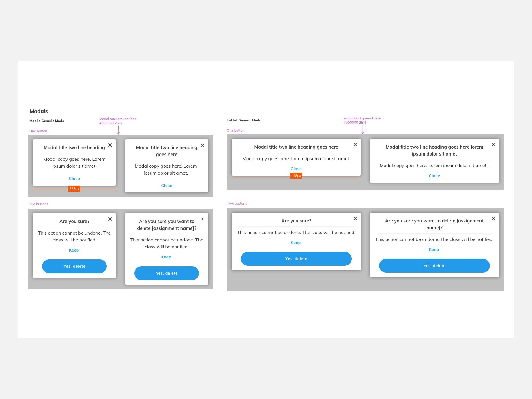
Modal specifications from the Primary pattern library in Sketch
Responsive design
The aim is to have a beautiful and consistent library of responsive and pedagogically accurate activities which could be used together in any combination to create a meaningful set of tasks for the learner or the teacher.
This includes interactive content, media and reference materials which all work together seamlessly from tiny mobile devices to super large interactive whiteboards.


